The typical follow-up question I get when I mention my field of study is, “You look at rocks all day or what?” That’s Geology, not Geography, and I’ll tell them as much. “Oh, so, you learn about capitals,” they’ll say, which is not incorrect, but does show a lack of understanding of the full spectrum of the subject. I’ll respond by telling them just how much I love memorizing those, hoping they’ll at least understand the full spectrum of sarcasm.
Some people do get Geography, though, and they’ll ask me, “You like maps, don’t you?” Fuck yes, I do.
With a map, you can figure out exactly where you are and how you relate to the Earth. You can briefly remove yourself from the reality of your world, and observe landscapes beyond the pulsating dot on your phone’s GPS–And, as a Geographer, I’ve learned that the people who create maps control much of our society today.
We are all affected by maps, in more ways than most people realize: The design of your neighborhood, your local shops, the services near walking distance to you, and even the ethnicity and income of your community are all influenced by geographic forces.
Ever wonder why, at one moment, you might be in a “nice” area, but if you walk down a couple of blocks, the scenery change is drastic? Or why the northern idyllic suburbia suddenly shifts to southern fenced-in homes with large dogs, overgrown vacant lots that corral abandoned furniture? At times it might seem like invisible lines divide the town, and sometimes they are very visible walls, like a freeway, or train tracks. This particular phenomenon is especially prevalent if you live within an urban Central Valley town.
But, before many of those visible lines, there were other lines that separated communities:
The Red Lines
In the early 1930s, long before the Civil Rights Movement or the construction of I-5, Congress established the Home Owners’ Loan Corporation (HOLC) and the Federal Housing Administration (FHA), to counteract the urban foreclosures during the Great Depression. The program was a tremendous success, but only for some.
From 1932 to 1964, the FHA with the assistance of HOLC helped hundreds of thousands of people become new homeowners, financing over $120 billion of new housing. However, less than 2% of this real estate was available to people of color. This government-led discrimination institutionalized segregation and destroyed the possibility of investment wherever people of color lived, especially in the urban cores, where most minorities resided.
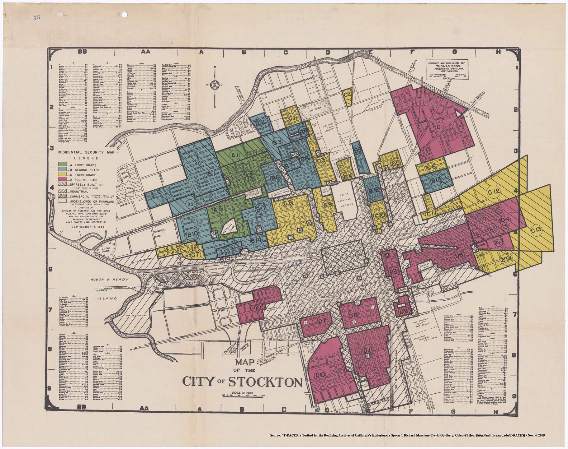
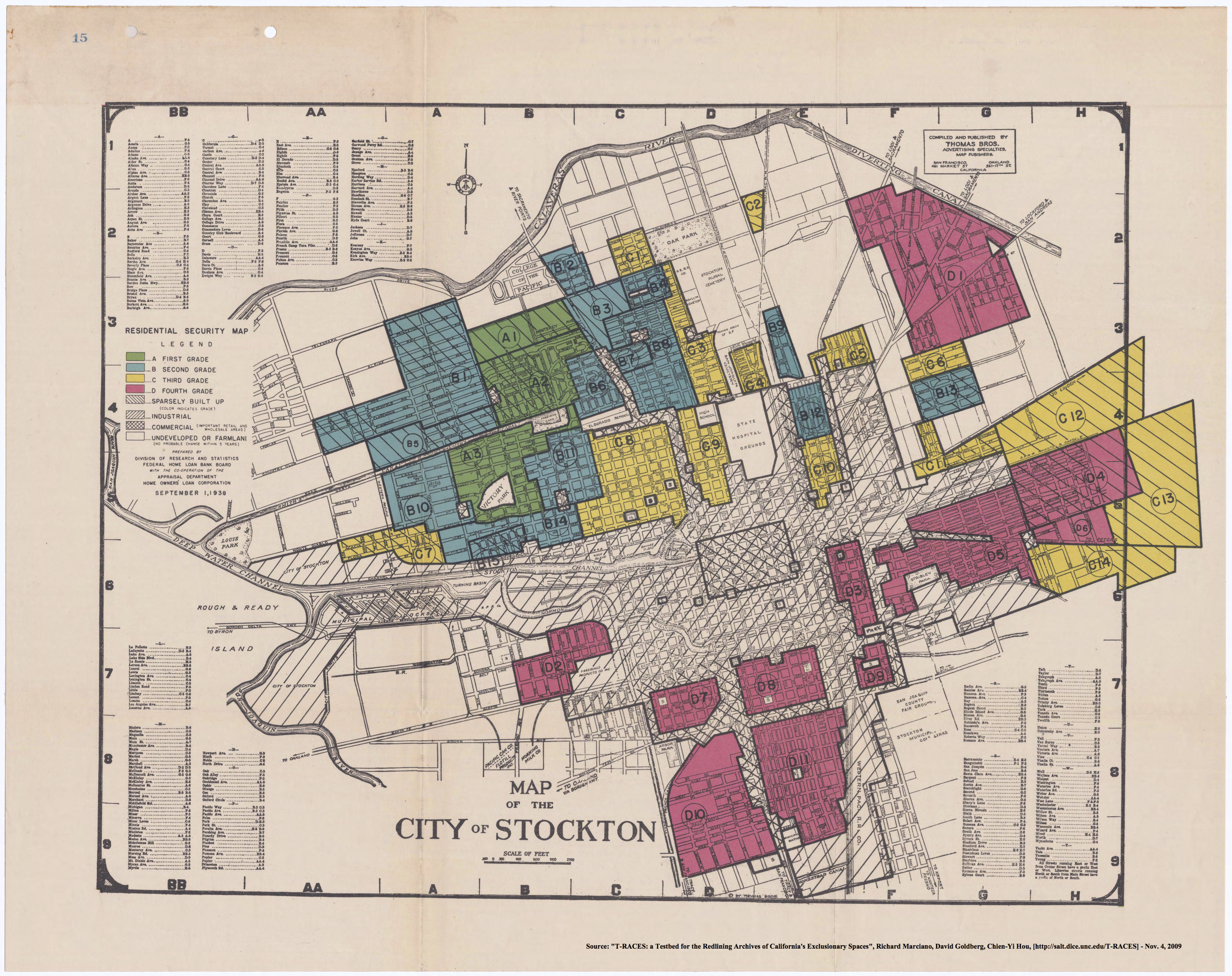
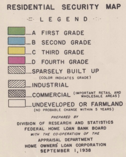
The FHA explicitly practiced a policy of redlining–methodologically denying or limiting financial services to communities of color solely based on their racial or ethnic composition. The term redlining comes from using red lines on a map to delineate areas where financial institutions should not invest. By 1938, HOLC had surveyed and “graded” neighborhoods in California’s major cities: Oakland, Sacramento, San Francisco, Stockton, Fresno, San Jose, San Diego, and Los Angeles. These classifications were deeply racist. Grade “A”, in green, were typically homogeneously white, suburban enclaves—hotspots for investments. The lowest ranking, “D”, were neighborhoods highlighted in red based on pollution, proximity to industrial zones, and infiltration of “Mexicans, negroes, and orientals.”
Recently, a team of scholars from four universities put together an interactive map titled “Mapping Inequality” which digitized over 150 HOLC’s maps and descriptions in high-resolution. The project, which is hosted by the University of Richmond, overlays these historic maps with a current map of US streets and symbols.
You can find the interactive maps here.
When looking at the site, you can select a city to reveal its historic maps, the rankings, and the reasons why neighborhoods were graded a particular way.
“There is a concentration of Mexican residents in the area, as well as many negroes and orientals. The best that can be hoped for this area is that it will develop into a business or industrial section. The area is graded low red.” This is a summary for a D-grade Stockton, CA neighborhood.
A report on a redlined community in La Jolla, CA reads: “This area is known as the servants’ quarters of La Jolla, being populated with the serving class of whites, negroes and Mexicans,” whose neighborhood was “set aside by common consent for the colored populations.”
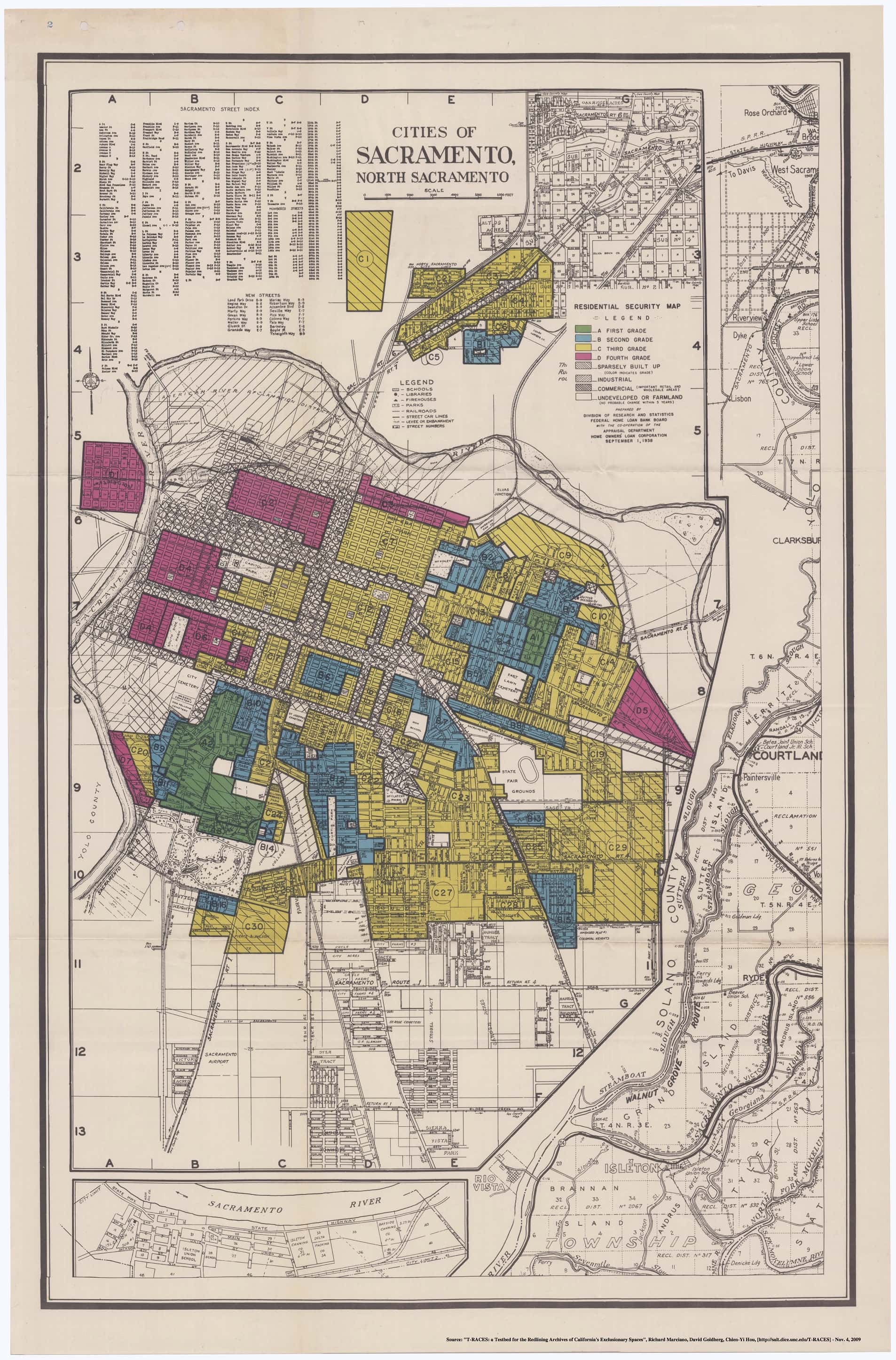
Many of the Sacramento’s West End neighborhood were redlined due to “subversive racial elements” where one section’s “particular hazard is ‘racial’; 30% of the population is foreign, including Orientals, Mexicans, and low-class Italians.”
These classifications drastically affected the ability of property owners to finance maintenance and repairs to their property, severely reducing the value in these areas. From 1938 to 1949, property in Sacramento experienced a 46 percent increase in value, while redlined neighborhoods decreased in value by 30 percent.
The story is the same in many cities; redlining steadily decreased property values of the urban core while suburbs and businesses expanded to the outer rings. Eventually, the construction of highways that connected these “homogeneous” enclaves and the subsequent “urban renewal projects” led to a forced exodus of entire non-white communities from the urban cores (such as the destruction of Little Manila in downtown Stockton.)
I know I said I love maps, but I wish some were never made.
Take a look at your city, your community, have things changed or have they remained the same since these maps were created?
NOTE: The views expressed here are those of the authors and do not necessarily represent or reflect the views of Placeholder.
Cover image by Wesley Allard and Javier Padilla